Your shopping cart is empty.
HEATHER MARTIN ART
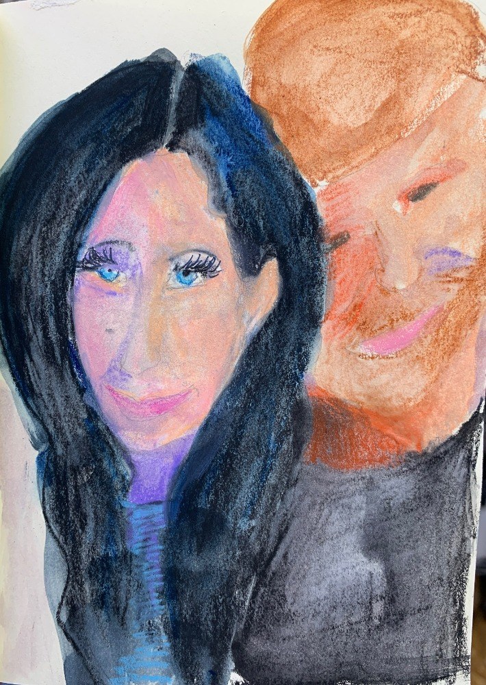
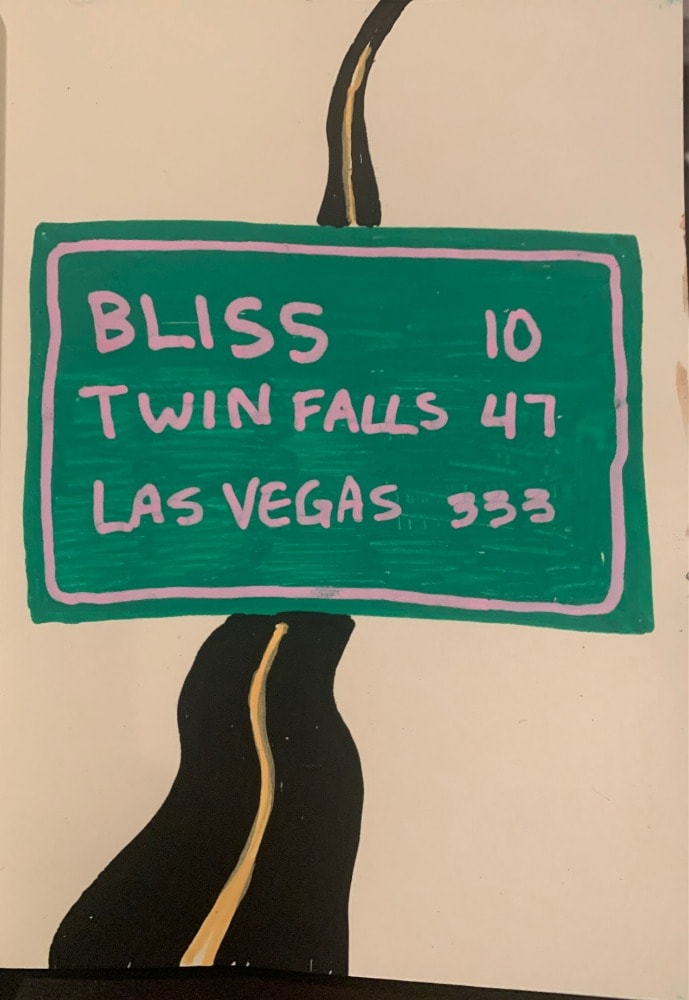
Abstract paintings sensing internal space.
Jun 26, 2023
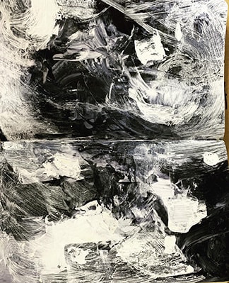
#1: Value - the contrast between light and dark, usually on a scale from 1 (white) to 10 (black). Some compositions utilize a narrow range, either on the lighter side, or the darker side, while others use a broad range, incorporating both black and white and shades in between. Here are a few of the images that I like best.
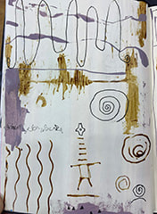
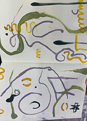
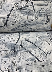
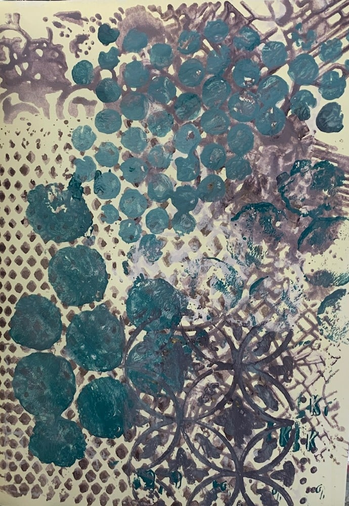
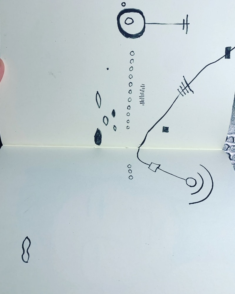
#2: Line - the quality of which can have many variations...and can be created in several different ways. There can be straight lines, wavy lines, curly Q lines, thin lines and thick lines. Some lines put together create a pattern. Most of these used an instrument to make the line on a blank page, and the last one shows line created by scraping back into a field of paint, with a different shade of color underneath.


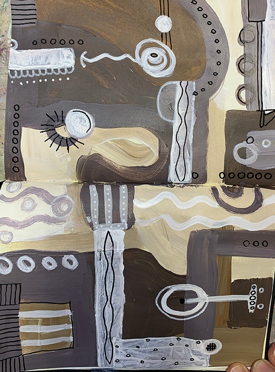
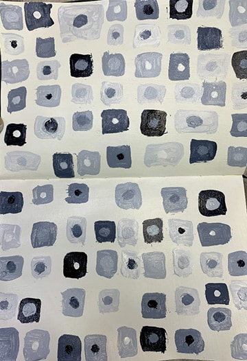
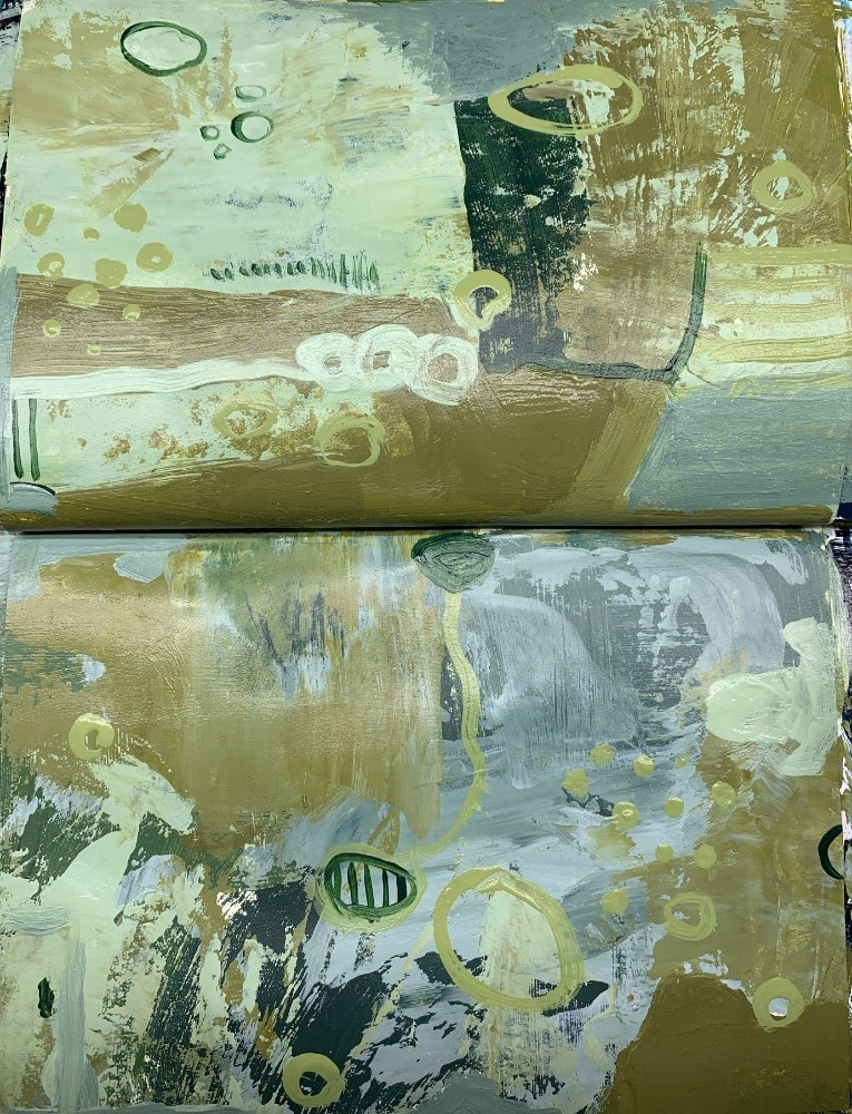
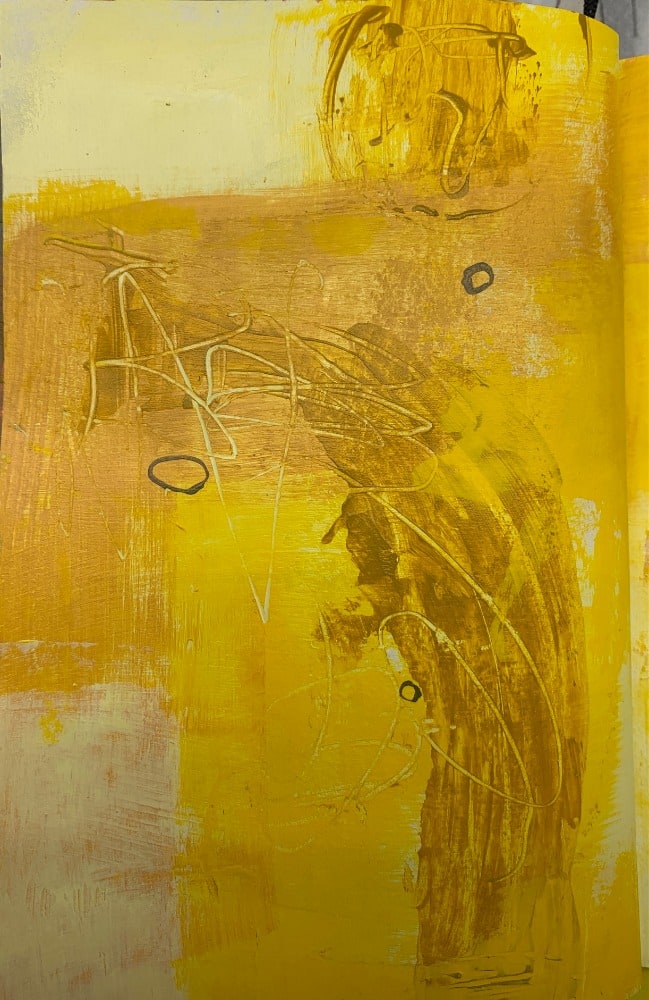
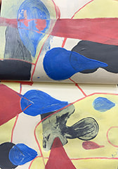
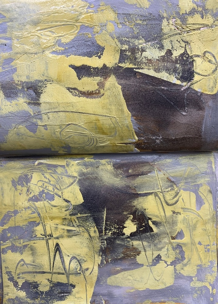
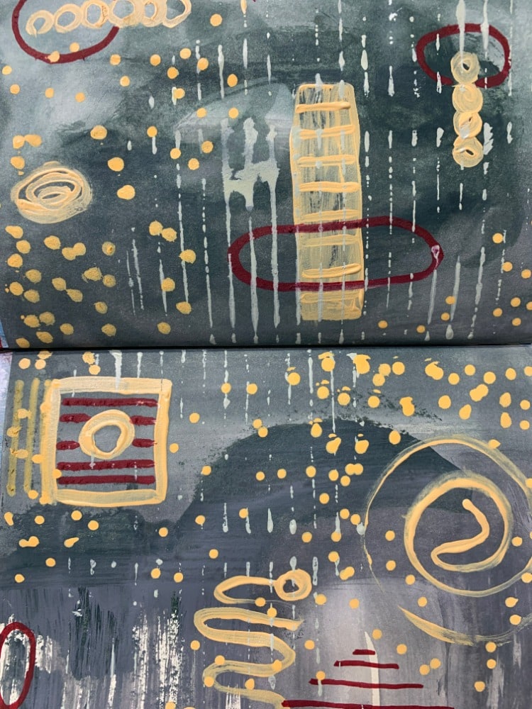
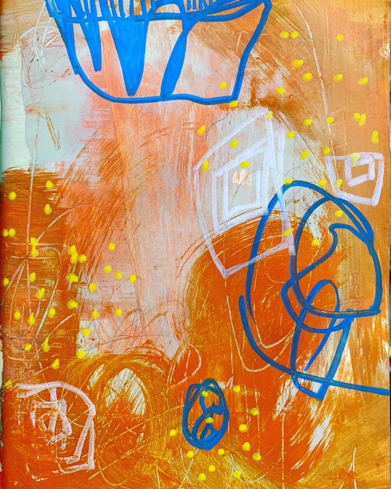
#3: Color - There are probably over a million different colors in the universe, but artists have categorized qualities of colors that help a conversation look both cohesive and interesting. Black and white are typically not considered colors per se, but when added to colors, the range expands into tints, tones and shades. I'll explain the strategies I used in the images provided. The first three images use one color predominantly, with various tints, tones and shades of that color: Green, Yellow, and Blue. These could also be considered as analogous color palettes.
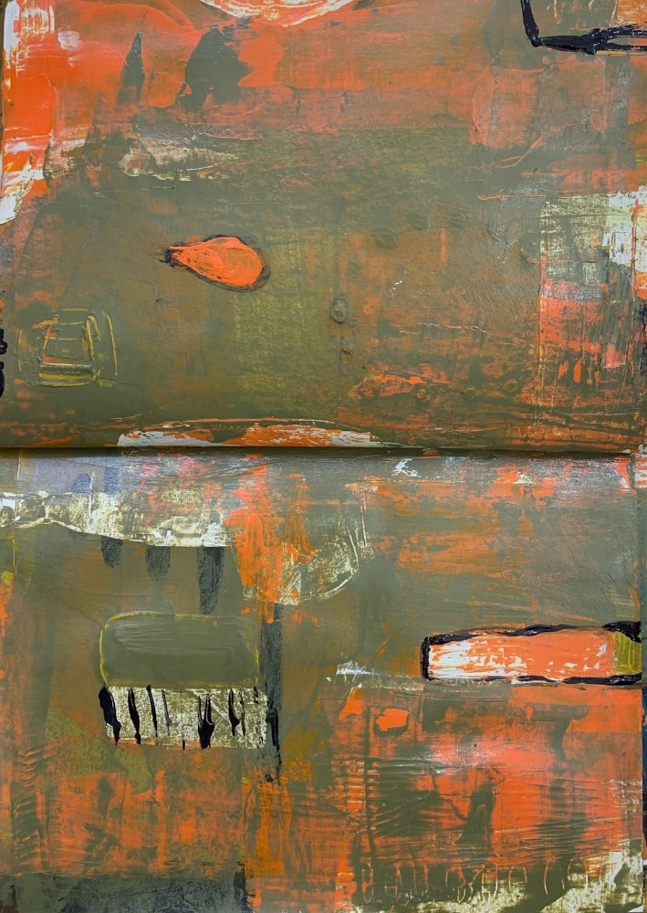
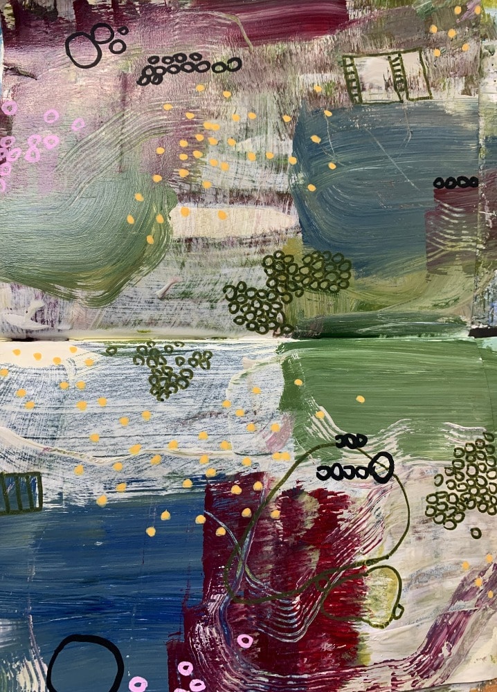
The second set of images use complementary colors, which can be not exactly opposite on the color wheel, but also one color off. So red is opposite green, but in the fourth image, I used orange instead of red, so the one next to the exact opposite of green. In the fifth image, purple and yellow were used (brown is considered to be in the yellow family). I also used dark/light contrast in this sketch to high-light differences.
The final image uses a lot of colors...but they are all in harmony, because they all contain a certain amount of Cadmium Orange.


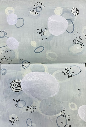
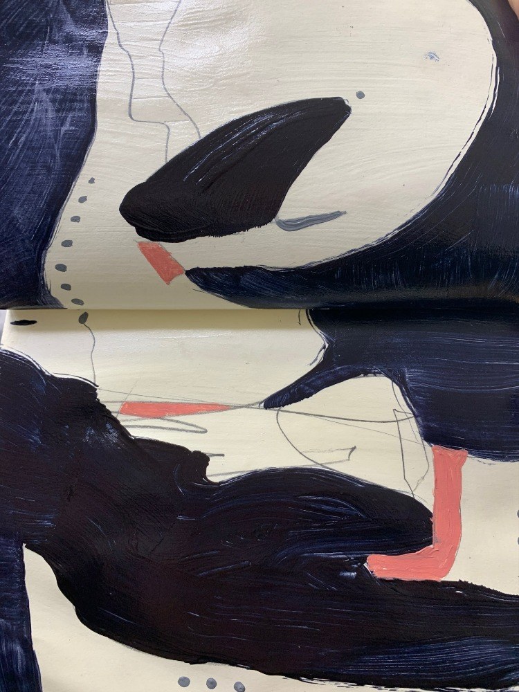
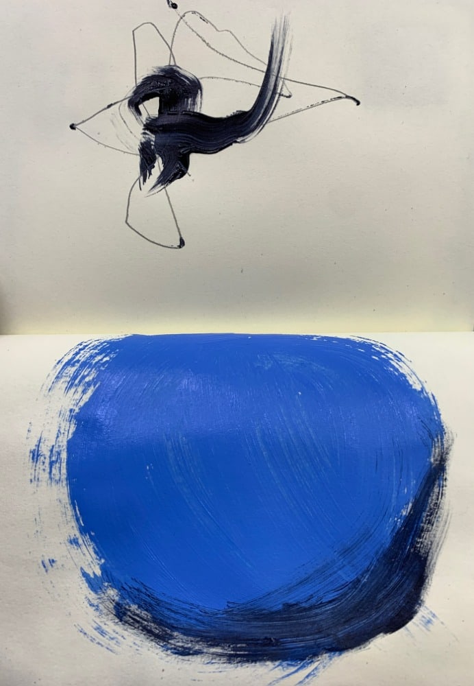
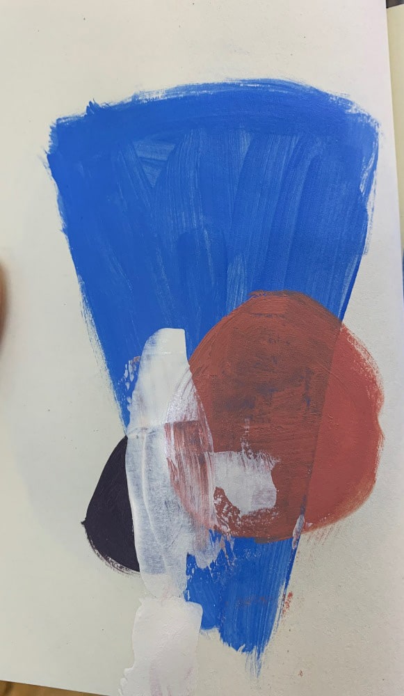
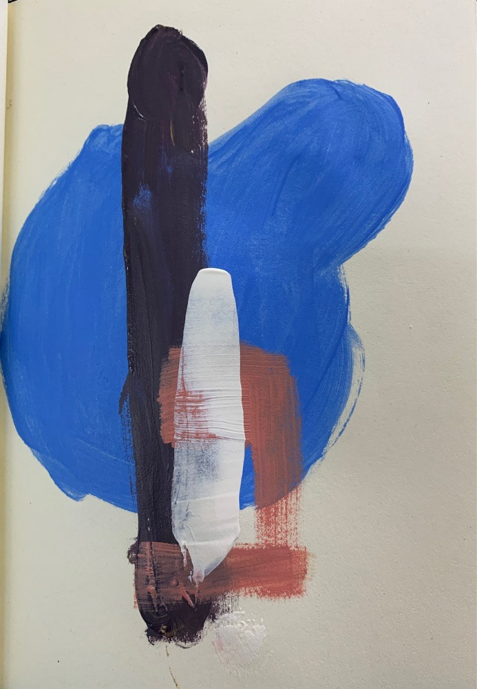
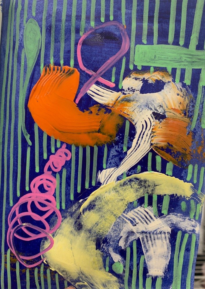
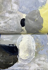
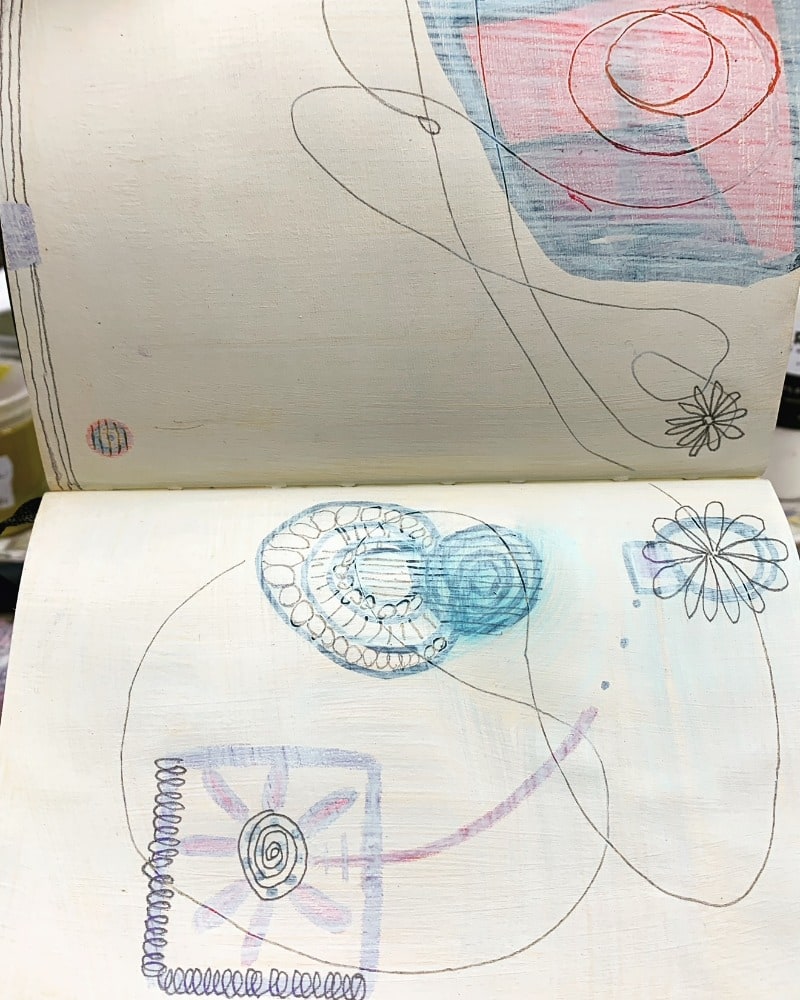
#4: Dominance - speaks to the weight of a shape/color in a composition. Below are examples of dominance in a composition, using different techniques. The first image shows a predominantly black & white composition, in which the black takes the dominance because it is darker.
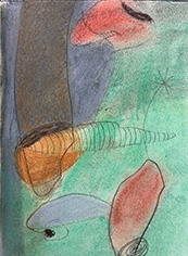
The second image creates a tension between the large object and the small object which is darker. I would argue that the darker shape still holds dominance even though it is smaller, because it feels more dynamic with the lines coming out of it and the gestural quality of the shape.
In the third image, dominance is created by layering shapes on top of shapes; the top shape being most dominant.
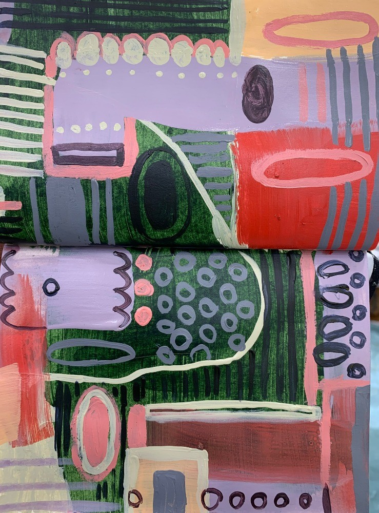
In the last image, I tried to find every saturated and bright color that I could find in my collection of paints, just to see which one stood out the most. But I would have to argue that the stripes create the dominance, because they create the largest shape, and the other shapes, and besides the pink, it's the most saturated color.
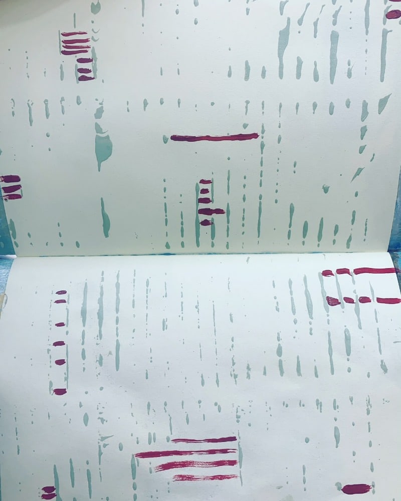
#5: Shape - is pretty self-explanatory and what I explored was different ways to create shapes; with a palette knife, paint brush, pulling up with a paper towel, acrylic pens, and pastel with pencil (left to right).
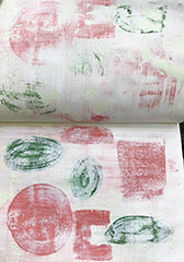
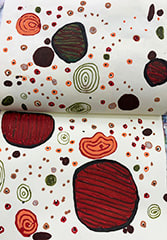
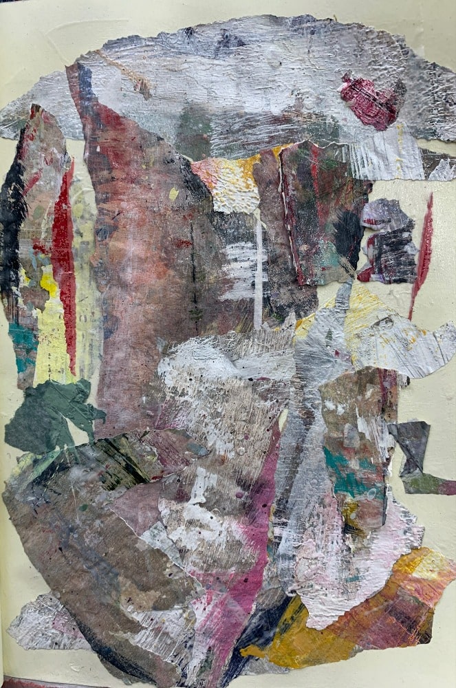
#6-Texture with different materials, such as peeled paint from my palette, molding paste, collaged papers, crackle paste, and stamped patterns. Some look better with a limited color palette...so that the texture stands out and sings.


#7: Form - is the hardest thing for me, partly because I'm just not interested. These images are the least engaging for me, but including them anyway so you can see the full process.
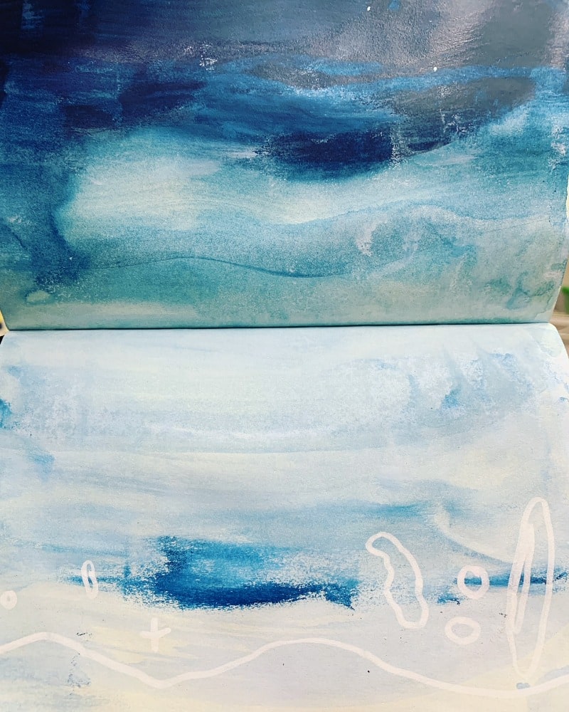
#8: Space - It was interesting to me when I did these compositions, that leaving empty space on the page, made me feel more spacious inside when I looked at them. My parents were a couple of pack rats, and I have to admit that I've struggled with creating more spaciousness in my home and my schedule. But now I'm inspired to make some changes, by this part of the exercise.

#9: Integration - incorporates several of the design elements, intentionally, into one composition.

This is only visible to you because you are logged in and are authorized to manage this website. This message is not visible to other website visitors.
This means you can use the camera on your phone or tablet and superimpose any piece of art onto a wall inside of your home or business.
To use this feature, Just look for the "Live Preview AR" button when viewing any piece of art on this website!
This means you can use the camera on your phone or tablet and superimpose any piece of art onto a wall inside of your home or business.
To use this feature, Just look for the "Live Preview AR" button when viewing any piece of art on this website!

SAVE 20% ON YOUR FIRST ORDER!
Enter your email below and we'll email you a 20% OFF Coupon right now!
This offer is valid for NEW CUSTOMERS only!